Case Competition PowerPoint Design 101
- Feb 05, 2016
- By Kalei
- In Case Competitions, Design
- 0 Comments
Every time I present publicly in a case competition, I get questions about what program I used to design the slide deck. To each person’s surprise, I use PowerPoint just like anyone else. People in the business world have a very specific idea of what PowerPoint slides look like. They envision the default templates that Microsoft provides, and bulleted text. If someone’s really fancy, they’ve opted out of the templates for something a bit more unique. While I don’t ever think this classic business PowerPoint will go obscure anytime soon, I prefer to completely redesign the look of slides, and avoid bullet points at all costs. I’m not going to tell you it’s easy to design a unique PowerPoint, but it’s doable and it doesn’t require any other slide design programs.
As far as presentation of data and research goes, a lot of the same principles apply to designing slide decks as designing infographics. For some basic ideas on information presentation, check out my PowerPoint infographic tutorial. I’m a big fan of the infographic style of visual representation of data. Charts and graphs can be a great way to demonstrate research or analysis when used correctly. I tend to take my design inspiration from whatever company the case focuses on. For the purpose of this post, all the examples I used are from the Global Business Health Case Competition in 2016, which was about fighting Pneumonia in Uganda. The company of focus was Gavi, which is where the color scheme and theme was derived from.
One quick tip I’ve picked up on in college that has absolutely saved my case competition life, is saving the PowerPoint as a PDF. Yes, this means you can’t use those fancy animations and transitions (but that’s a good thing), and you’ll have to separate any slides that have added information into a multiple slide series (see tips for decision matrix below). By doing this, you’ll make sure to rid any risks of formatting differences between whatever computer you designed your slides on, and whatever computer you’re presenting on. You’re also now able to use fonts that aren’t standard. All in all, exporting your PowerPoint to PDF is just a way to ensure that your deck looks the way you intended it to. When presenting, just use the “full screen view”, and click through slides as you would in a normal PowerPoint deck.
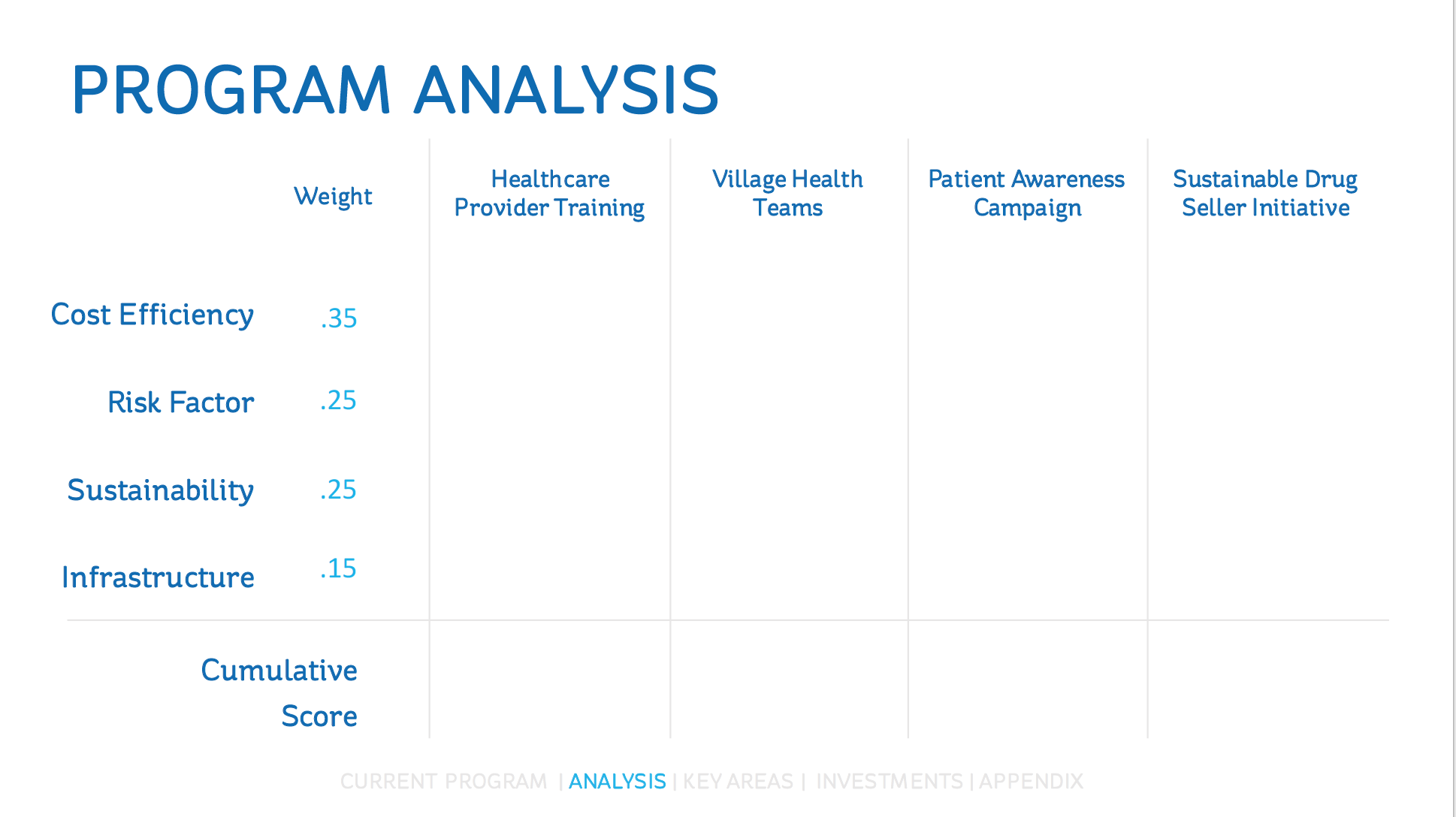
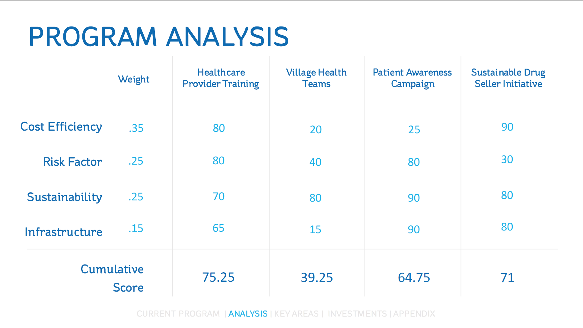
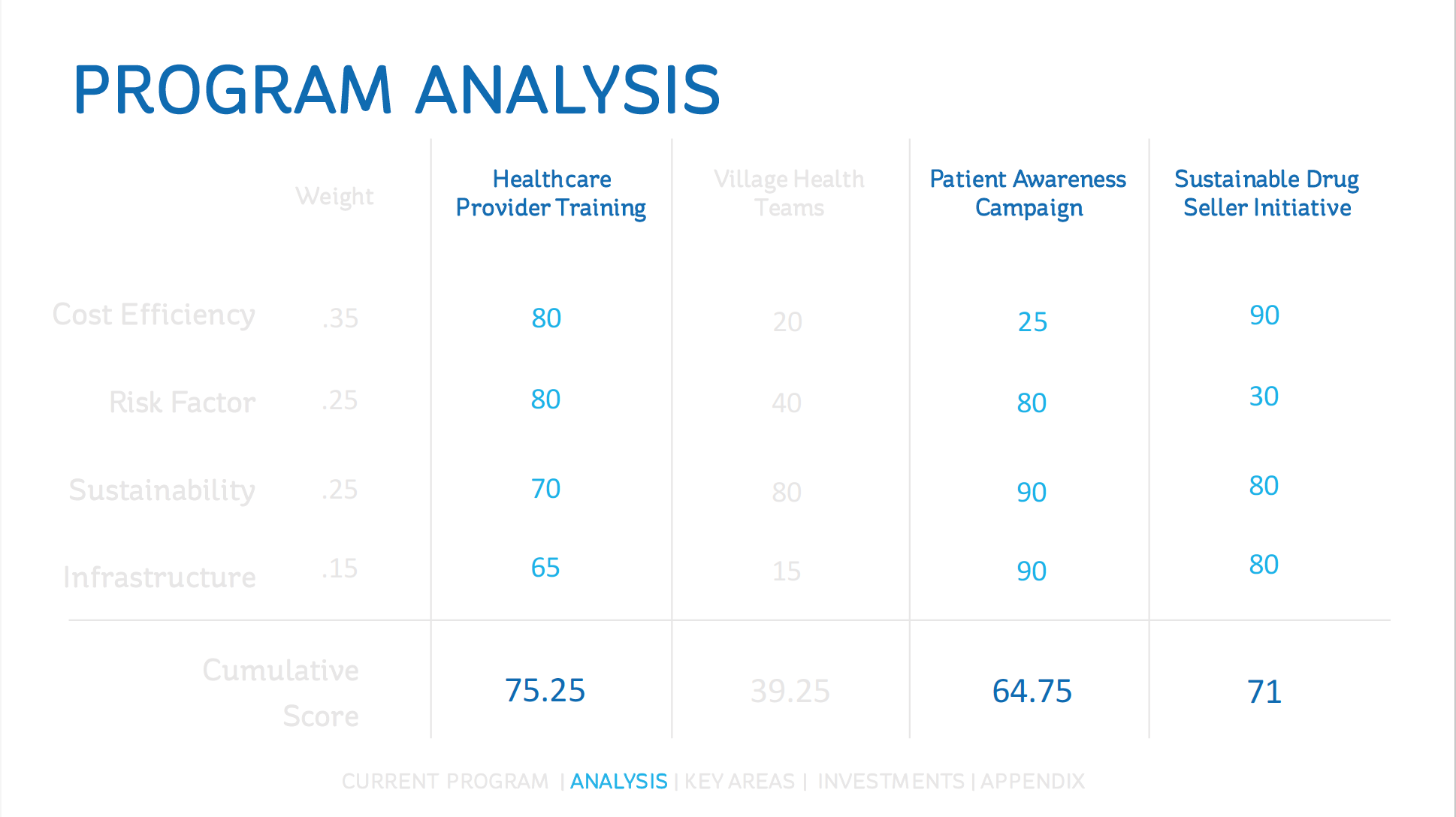
In nearly every case competition I’ve competed in, I’ve found a way to use a decision matrix. This is a chart that compares decision alternatives (often a huge part of cases) with factors of analysis. Decision matrices are probably one of the single most useful tools in a case, but you have to be extremely careful about how you show them. Because you’re displaying so much information and analysis on one slide, it can look intimidating very easily. I prefer extremely simplistic table layouts, with a very minimalistic approach to the design. Coordinate the matrix with the rest of your slides, but don’t add anything extra like photos, symbols, or colors that are unnecessary. I’ve had a lot of success with turning the decision matrix into a 3-slide series: the first slide just showing the factors you’re analyzing and the different options, the second slide filling in the numbers to show your analysis, and the third slide highlighting only the decision(s) you decided to move forward with. See below for an example of this 3-slide series:
Another thing that people often overlook when designing case slides, is transition slides. They’re completely unnecessary to your presentation, yet they make a massive difference in the professionalism of your approach. I like to design transition slides with a very simple and non-distracting background, and maybe a single title if it fits the scenario. These slides won’t contain content about your case, but they do provide a buffer for you to switch speakers, or introduce a new topic. By adding these buffers, your presentation comes off much more polished and professional, and you’re able to easily switch gears without losing your audience. See example of a transition slide I used in that last case competition:

Finally, don’t forget about appendix slides. Case competitions often give you a 10-20 minute presentation on a topic that you could talk about for days. Naturally, you’ll have to learn to narrow it down to the important stuff: your analysis, decision, and forecast. This doesn’t mean that you forget about all the details though, probably 1/4 of the time I spend on the project, I’m working on putting together appendix slides. Slides that you might want to reference during Q&A or feedback periods (if applicable to your case). Often these slides include more detailed analysis slides (SWOT, STP, etc.) or more detailed financial data (balance sheets, explanations for forecasts, etc.). To use an appendix effectively, create a slide that will be displayed during the Q&A time, and link to the extra slides on this single slide. See example appendix slides below:
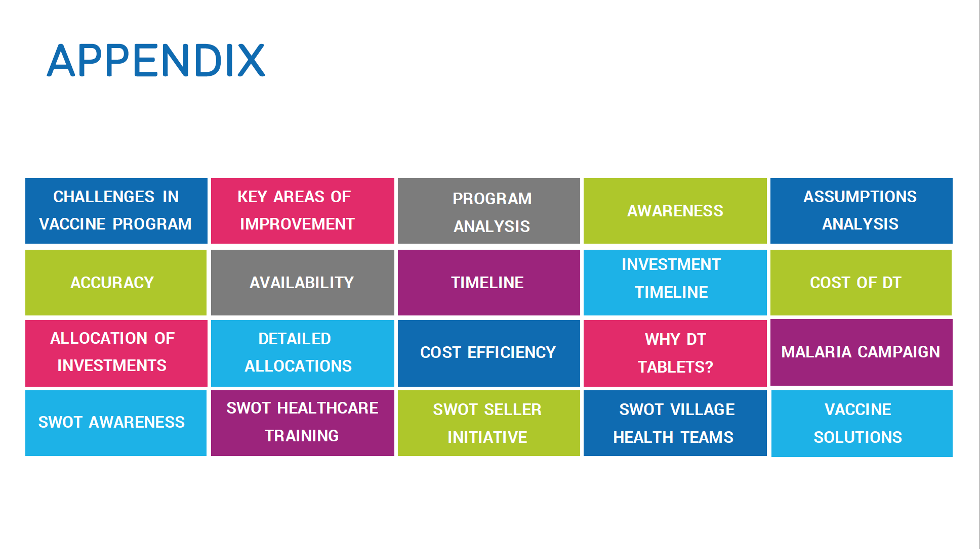
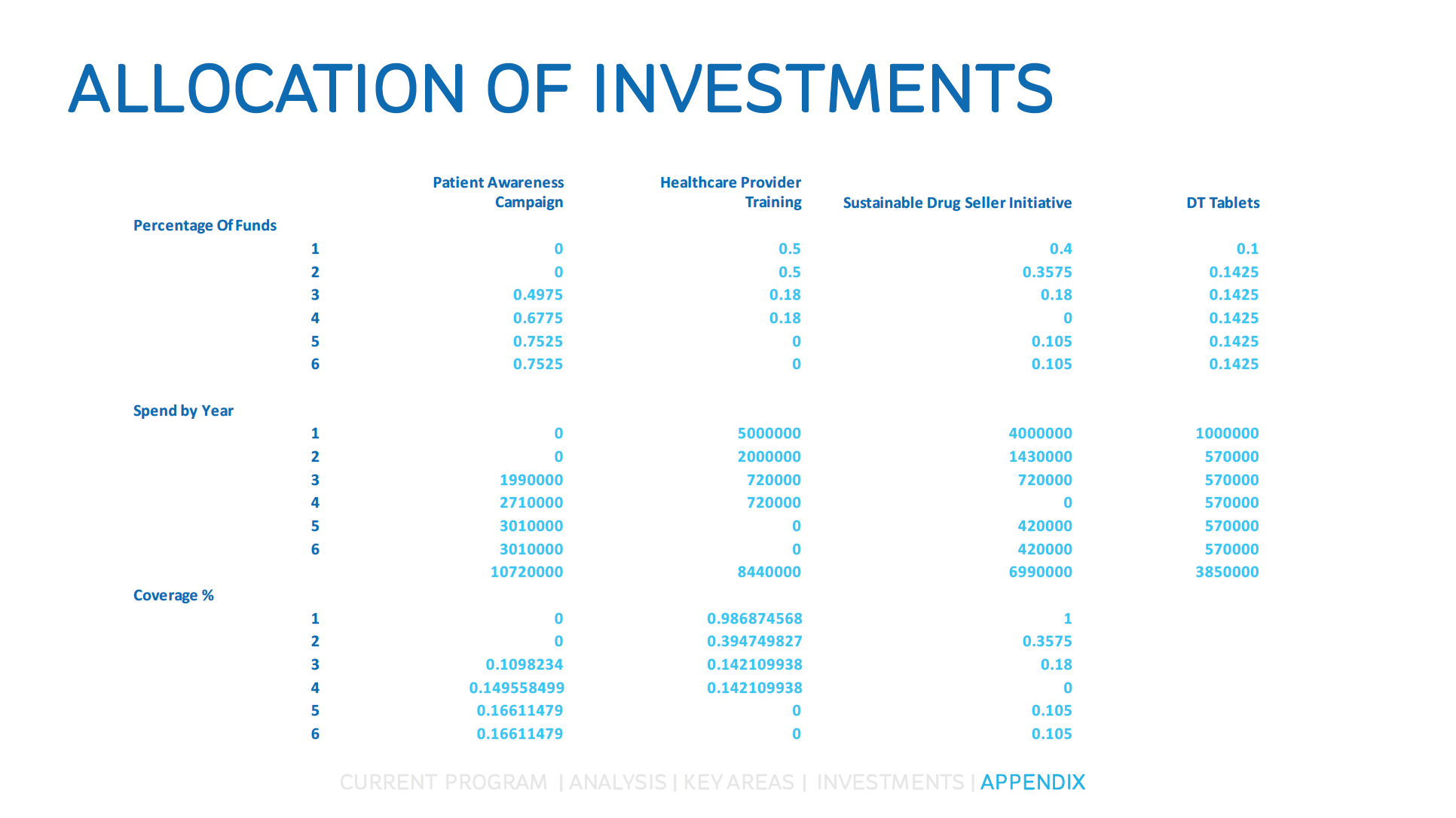
Notice the progress bar at the bottom of each of the slide examples. By highlighting the section of the presentation that you’re in, you give judges an idea of the structure. They know where you’re at, and where you’ve been. It’s an easy reference of timeline to your presentation. In addition to this, it gives you a place to link back to the Appendix to jump back and forth during Q&A.

Finally, the best tip I can give someone for slide design is to keep things simple. Simplicity appeals to everyone; especially when you’re throwing a bunch of data at five judges who only have 10 minutes to understand your case. Use your slide deck to create a visual representation of what you’re saying, don’t just repeat what you’ve already written.
Anyone can create a professional looking slide deck. It takes a lot of time, practice, and an eye for design— none of these things are out of reach for aspiring case-compers. Spend time looking at professional slide decks that you admire, and don’t be afraid to take inspiration from them. Look for the combination of simple shapes and charts that make these slides look impressive, and find a way to recreate the look yourself. Good luck!
1
20607
Recent Posts
-
 My Final Case Competition – Starbucks & Kombucha
March 23, 2018
 -
 HCDE: Intended and Unintended Consequences of Pokemon GO
March 6, 2018
 -
 Review: “Contagious: Why Things Catch On” by Jonah Berger
February 12, 2018


